DIGITAL STYLE GUIDE
a design systems project for Lovesac (2019)
Accessibility problems
Lovesac’s product suite needed an audit for WCAG compliance
Our design system started as a tool to help me rectify issues I found while performing a WCAG audit on the Lovesac website. There were a number of elements on the site that caused repeat contrast and functional exceptions, so each time I encountered one, I recorded the correct solution in code and design so future corrections would take less time and recollection.
Ultimately the audit and related corrections brought the Lovesac site near 100% compliance according to Deque’s Axe plugin, rendering this digital style guide a key tool for our continued accessibility.
Planning for scaling
It takes a village to raise an omnichannel experience
It’s important to note that Lovesac’s digital experience was constructed almost entirely by external agencies. As the accessibility audit pressed on, Lovesac started taking on more and more digital experience partners to help compose its omnichannel experience, topping off at around 15.
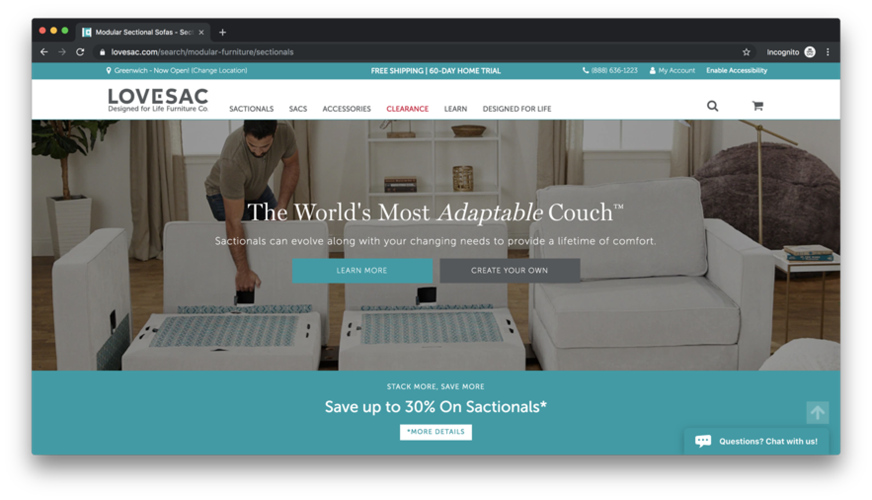
When examining which sections of the site were built by which agency, I found tons of visual disparities which, compounded with inconsistencies created internally, created an area of opportunity around lacing up our visual rhythm. This created a second major selling point for design systems work -- to ensure that all the people involved in building our digital experience were, proverbially, painting with the same brush.
One example of inconsistent buttons across a single viewport on Lovesac’s initial homepage
Once the broader team was made aware of these inconsistencies, I attempted to verify that my saved styles would work as a consistency tool as much as an accessibility tool using Chrome DevTools. Fortunately, the effect on base look and feel was minimal, while still imposing more consistent visual rhythm.
Before
After
Visual design
Interpreting physical products digitally
Prior to the style guide’s creation, the existing brand guide offered little guidance on how to fit the base visual identity into a digital setting, and the brand team was hesitant to expand what could exist. Additionally, visual design guidance was cleverly based around the shape of Lovesac’s modular couch system — recommended layouts were made of 3:4 ratio rectangles with no gutters, and most border radii and non-rectangular shapes in general were disallowed.
Probably the most impactful novel inclusions in the design system were the spacing rhythm and formal type scale. Pre-design system, element sizes were defined based on page need, but that led to differences in size relations from page to page. Thus, I instituted a base-8 rhythm for both spacing and text and created definitions for differently-sized pieces to keep consistent visual balance across platforms.
Another important development was the inclusion of hover and focus states to interactive elements, where none previously existed. A lot of possible shape- and size-based changes didn't quite fit into the brand guide, so I had the opportunity to expand the company's grey palette and add shades to the brand primary colors for this purpose. The expanded grey scale also allowed for more nuanced options in creating page hierarchy.
Internal Validation
Stronger bonds between UX, Brand, and Engineering
Prior to the design system work, my team’s relationship with the Creative department was largely to hand off assets and review site feature concepts. However, as a design system is meant to match up our brand with our digital experience, I included the Creative team in my design system work to ensure that the details matched the broader picture of the brand.
While the Creative team’s review of my style guide developments allowed me to reduce the number of review rounds when building a new feature, it more importantly gave them more direct influence over the site’s UI and how it intersects with the brand without repeating instructions to multiple agencies.
Delivery
Bringing outside agencies into our brand
My work began to materialize just before a major site replatforming, so I made quick work of recording accessibility standards, type and sizing scales, and token-level styles in a Storybook-style documentation site to be handed over to the agencies who would be working on our new site. In preparation for this handoff, I was able to test my system by using it to draw styles from when coding informational pages on the Lovesac website which, at least subjectively, made my coding work a lot more efficient.
Unfortunately, I left Lovesac before the replatforming began in earnest, but I was able to see in early stages how the agencies we worked with began to integrate it into their work. The meetings where this happened thankfully didn’t include a lot of conversations around baseline WCAG and brand compliance, which to me signals that it did what I had hoped it to.


