CONFIGURATOR REFRESH
a feature redesign project for Lovesac.

* This case study represents work I completed before leaving the company around a year before launch, and does not represent the final product.
Initial Insights
Opportunities to educate away sticker shock
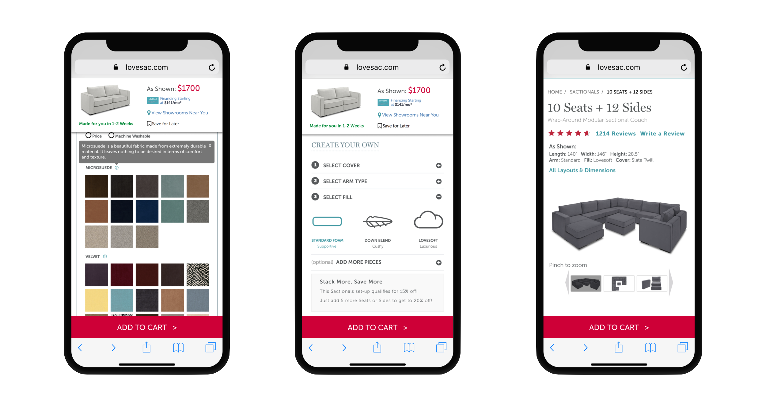
My team had found through heuristic evaluation (both my own and external) and third-party usability testing that while the product detail pages (PDPs) for our Sactionals couches offered a great deal of customizability, we had a fair bit of opportunity to give users more information about why certain choices were being offered to them. Most importantly, users were curious about the firmness of different fills, durability and characteristics of our cover fabrics, financing, and how changes in material affect price.
Thus, a reimagining was in order. Our biggest challenge here was rebuilding in such a way that would minimize time and effort on the part of our offsite development team, as their backlog was already overloaded with other projects of ours.
Price visibility
New Controls always kept within reach
Lovesac’s initial experience pushed price, lead time, and financing info far below the fold once a configuration drawer is opened up, which makes changes in price based on configuration a bit of a shock when shoppers are finally ready to check out. I rectified this on our mobile site by proposing a sticky info module on the top of the screen which includes a product thumbnail that updates with one’s fabric selection and all relevant pricing information, and an Add To Cart button near the bottom of the screen, always within reach. On desktop, both the Add To Cart button and info module are contained in an ever-present sticky footer.

Product info
Bringing Key details front and center
As for the concerns about materials (and, linking back to comments about highlighting product measurements), we decided to add subtle text changes in the PDP wherever appropriate, and create tooltips for each Cover fabric to give some information about a material’s feel and qualities. One reason for this was because, while a little bit of added or reorganized information goes a long way in this case, our materials are a very nuanced aspect of our brand’s many-layered USP, and we didn’t want to short users any critical details. But also, zeroing in on text-based changes lifted a large potential development and design burden and allowed us to push changes in short order.
The final finishing touch on our PDP was to add captions to some of our product images and reconsider what actual product images we’d display in order to show and tell finer details that wouldn’t be obvious in our existing photos, as our image lineup and its purpose are currently somewhat unclear.
I ultimately left Lovesac before this was able to be developed, and the configurator refresh project was engulfed by a larger-scale full site redesign. However, all of the core tenets of my solution here — persistent price and CTA, intuitive navigability, and upfront product detail — seem to have carried over into their new configurator.