BRAND REFRESH + MERGE
a client design systems project through 17seconds.

NOTE: Since this project is protected by a strict Non-Disclosure Agreement, I’ve omitted the clients’ names and any specific specific identifiers to protect all sensitive data. To the best of my knowledge, no designs included herein have been reproduced exactly as pictured in any final products, though I’ve attempted to recreate my work as best as I could given these constraints..
Background
An experiment in merging brands
At 17seconds, the client I designed for was a large bank (we’ll call them Bank from here on out) who’d recently acquired a fintech company (henceforth referred to as Org). For the first six months of my tenure, both Bank and Org were being treated as separate entities with the same governing body, but it was soon realized that both groups had a significant amount of feature overlap, and Bank began the process of truly consuming Org into its ecosystem.
After bringing Bank’s consumer-facing web design system into Figma from Sketch with my team at 17seconds, I was called on to help support the merging of that design system with Org’s alongside a product designer and art director from my own agency. We reported to design directors from both Bank and Org to get balanced approval while the teams meshed alongside their designs.

Understanding our themes
Different brands, different personalities
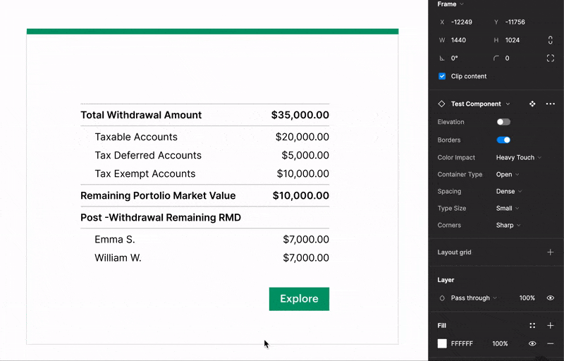
In order to get a handle on what the actual visual direction of this new system should be, my agency cohort and I created a matrix of as many visual attributes as I could think of that might define a brand. Attached to each attribute, I created a spectrum between the two most opposite values one could possibly assign to it; for example, we included a “corner radius” attribute whose spectrum ranged from “sharp” to “round”. These were tied to examples of brands in the wild for reviewers’ understanding.

I then built out a monstrosity of a Card component using Figma’s Variants feature that tied each attribute to a component property, and each attribute’s value to a property value. This was shared with stakeholders so they could have an interactive, concretely visual example of what we were measuring. We used this component to create descriptor matrices for a number of Org and Bank’s product visual identities, then used those to start putting together a matrix for the system we would soon be building. Once we had these answers, we could start setting a direction for our visual refresh.
Since Bank would be the one absorbing Org’s features, upper management determined that our matrices would be applied on top of the core Bank brand. On top of this, we’d decided to change typefaces to make numerical presentations and tables clearer and more even.
Trying it out
A pattern that scales beautifully
In order to see if this direction would fly, we were given a set of key Org screens from our Org-side manager and brought them into our newly-created look and feel. To accomplish this, I first made a copy of Bank’s consumer-side design system, applied the updates from the last step of the process, and filled in a number of missing components that Org’s system had but Bank’s did not.
Then, I used Figma’s “Swap Library” function on the key screens to bring them into the new ecosystem and corrected mistakes brought about by the programmatic change. From here, my team and I determined both broad- and component-based changes before sharing our proposal with management. While this was going on, we connected with our design technology team to create tokens for each core value in our new system.

The final step in the process before handoff was to find and solve cases where neither brand had an answer to a visual design problem. A great example of this was form fields — Bank’s were very tight and data-dense and didn’t work on larger, simpler screens, whereas Org’s were frequently too open for data-intensive screens. We came up with two potential ways to do this: either give fields variants for data-dense and open views that roughly matched in style, or find a style that could straddle the line but exist in two sizes. We showed both options to management before my departure from 17seconds.
